


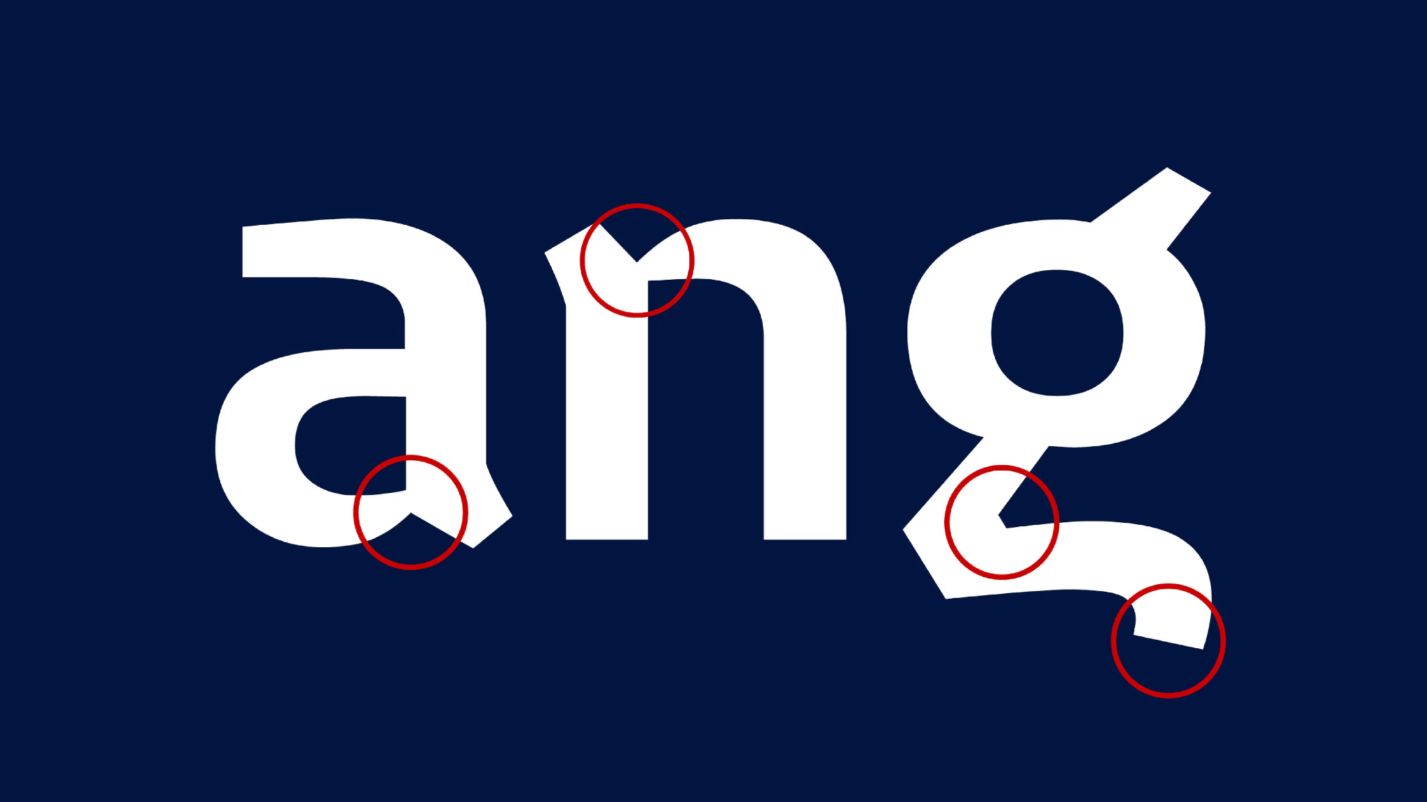
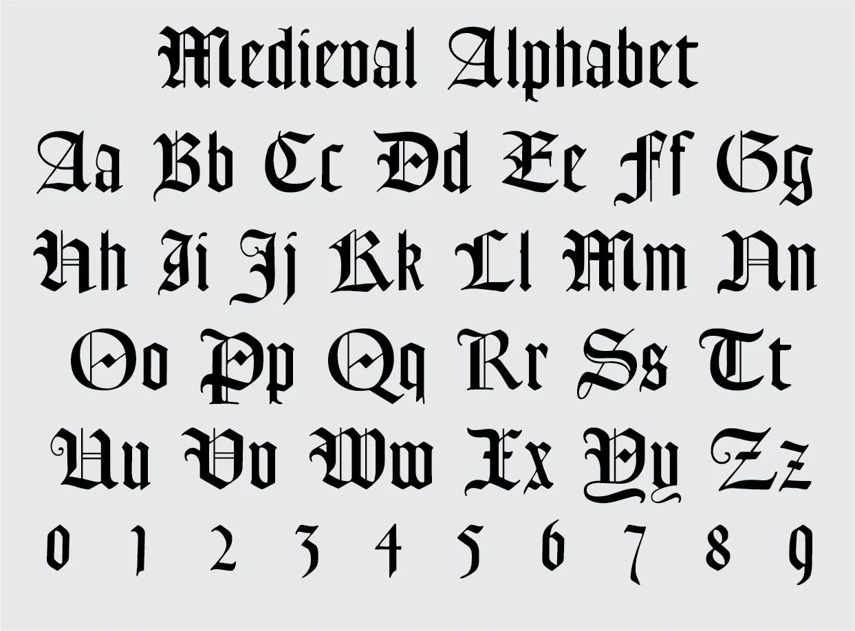
Somewhere in the Danish alphabet, there’s a lowercase letter shaped like a heart.
It’s the “g” — and unlike the two-story ‘g’ most of us grew up writing, the Danish version is open, single-story, with a softly slanted tail that curls into something close to a heart. It’s not a font trend or a branding gimmick. It’s a hundred-year-old design decision, born from a movement most people have never heard of: Skønvirke.
The Idea
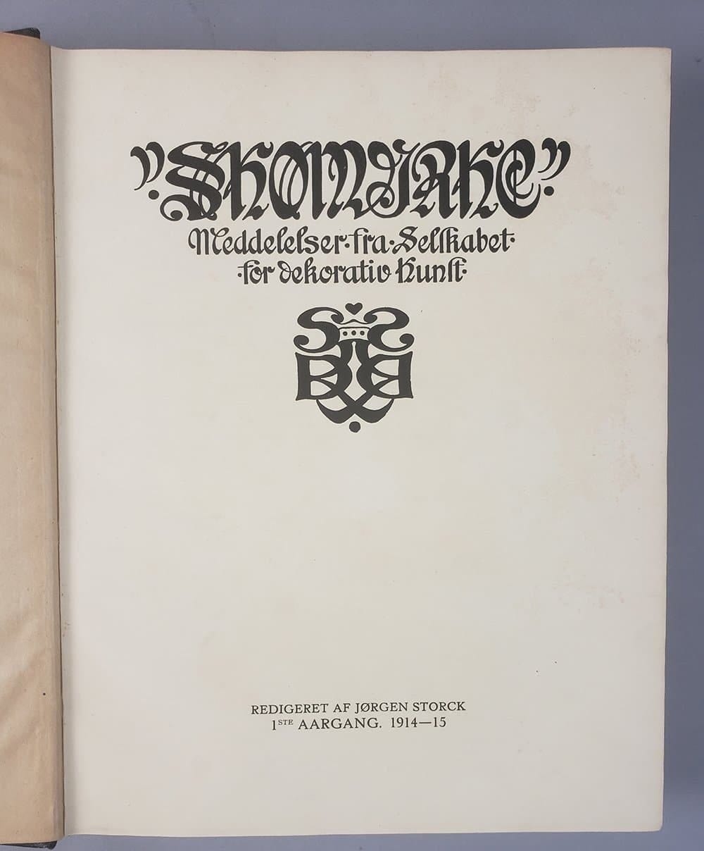
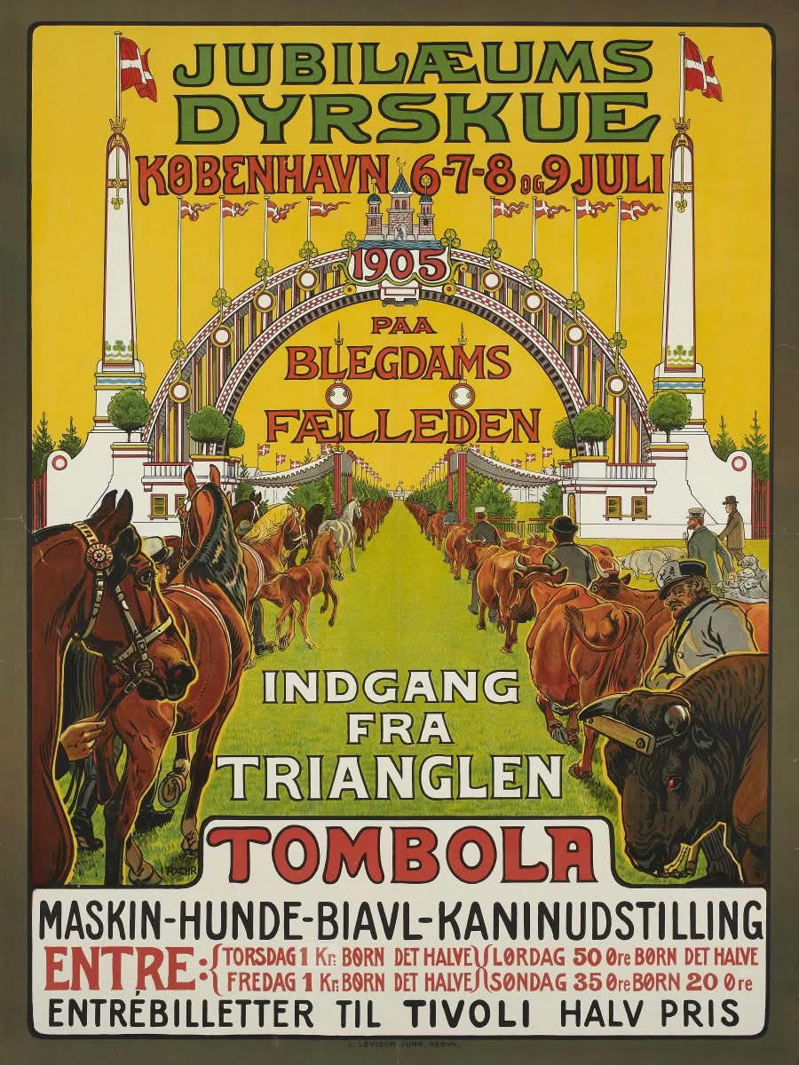
Skønvirke means, literally, “beautiful work.” It emerged around 1895–1915, when Denmark was developing its own answer to the Art Nouveau sweeping Europe — blending Art Nouveau’s organic lines with the British Arts & Crafts emphasis on craftsmanship, and a homegrown wave of Danish National Romanticism that was busy figuring out what “Danish” even meant.
What made Skønvirke distinct was its restraint. Where international Art Nouveau often went ornate, Skønvirke stayed grounded — rustic, sturdy, slightly imperfect on purpose. Visible hammer marks were left in metalwork. Joinery showed its joints. The hand of the maker was the point, not something to be smoothed away.
And crucially: Skønvirke didn’t reject industry. It used industrial methods flexibly, so that beautiful, well-made things could reach more people — not just the wealthy. That single idea — beauty, made by hand, made for everyone — is the root of almost everything that came after in Danish design.
In Practice
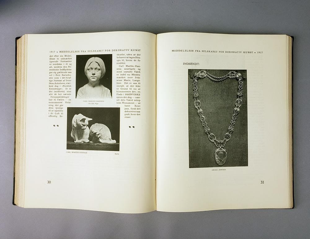
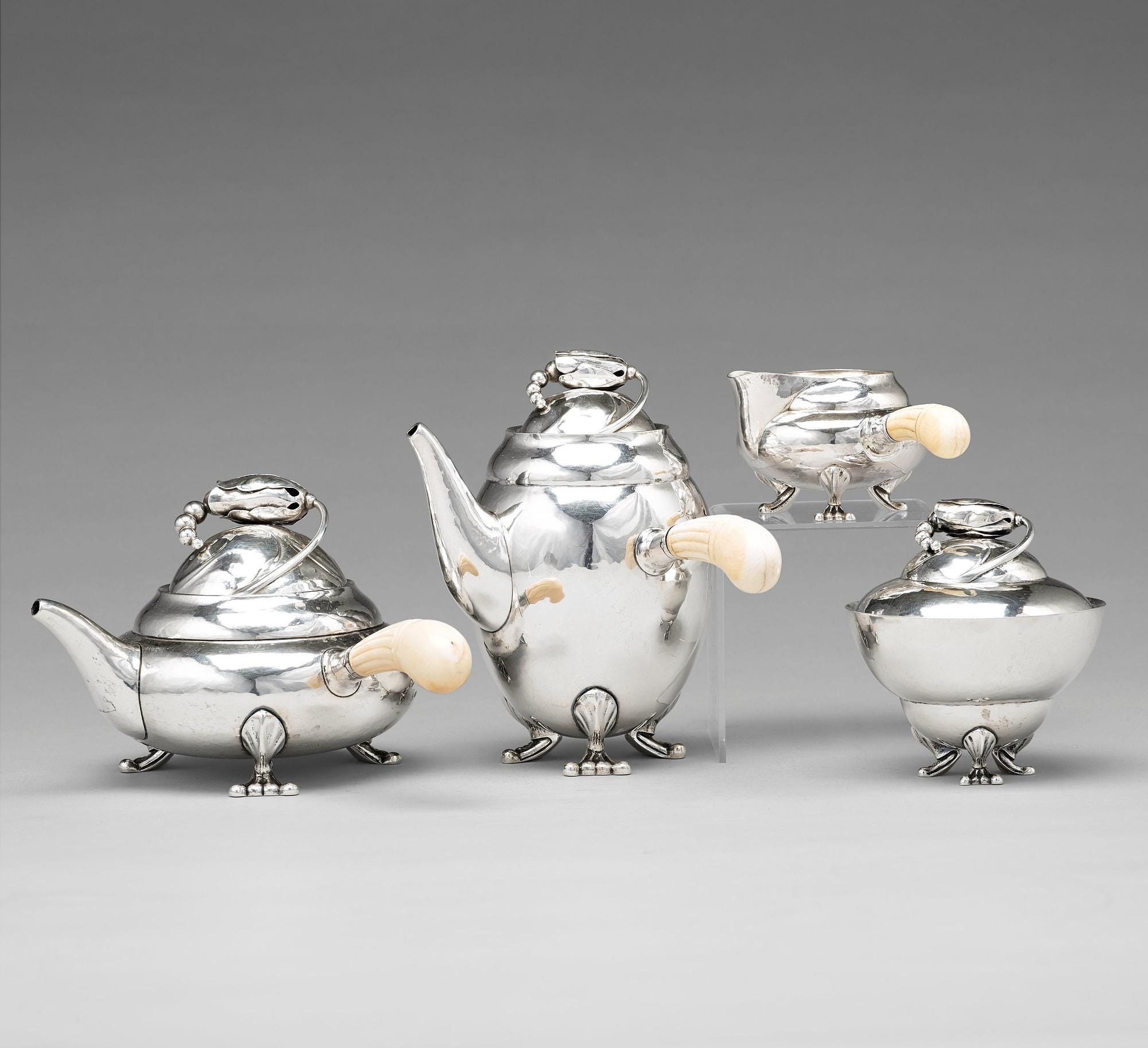
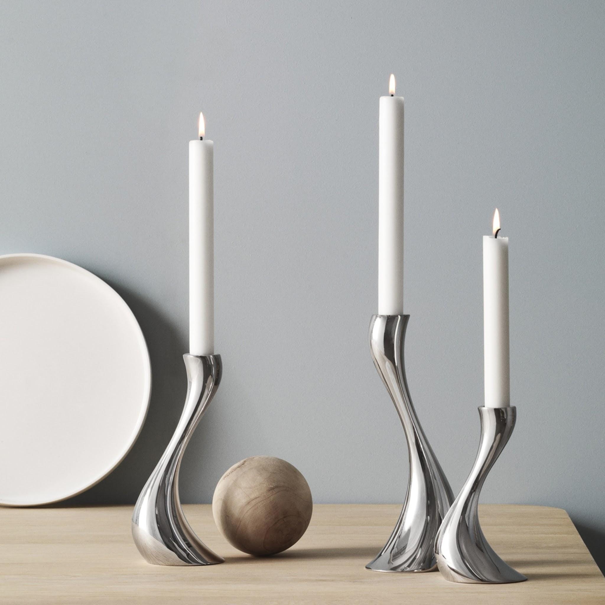
Georg Jensen, Denmark’s most famous silversmith, built his reputation on nature: flowing lines, plant and flower motifs, and sculptural silverware like the Blossom tea set and Cobra candleholders — pieces that still feel alive today.
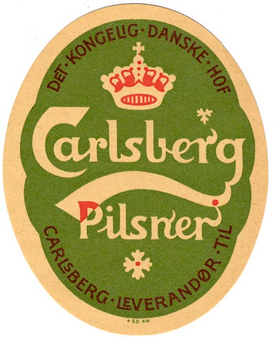
Thorvald Bindesbøll brought that same spontaneous, nature-inspired hand to graphic design. His 1904 Carlsberg logo — that green-and-white emblem with the star and crown — is still in use, over a century later.
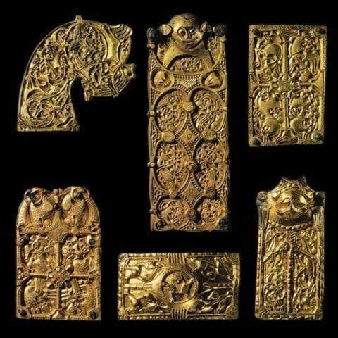
The “Danish g” itself emerged from Skønvirke typography, inspired by Viking ornamentation and medieval lettering. It’s a tiny, easy-to-miss detail that’s become a quiet signature of Danish design.
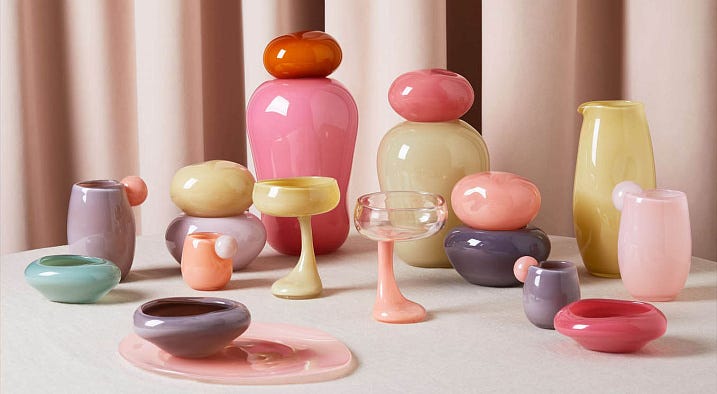
A modern heir: Helle Mardahl, whose mouth-blown glass “candy objects” and Bonbonnieres carry the same spirit — handmade, a little imperfect, and made to be loved for exactly that reason.
Try This
Look at something you made or shipped this week — a document, a design, a piece of work.
Where is your hand still visible in it? And where have you smoothed it out completely? Skønvirke’s whole premise was that the visible trace of a human hand — a “hammer mark” — makes something more valuable, not less.
Doesn’t have to be answered now. Just notice it. (We’ll come back to this one in a future Bloomerangas session.)
Next week: One Man, 500 Chairs - how Danish design decided function and beauty didn’t have to compete.


