
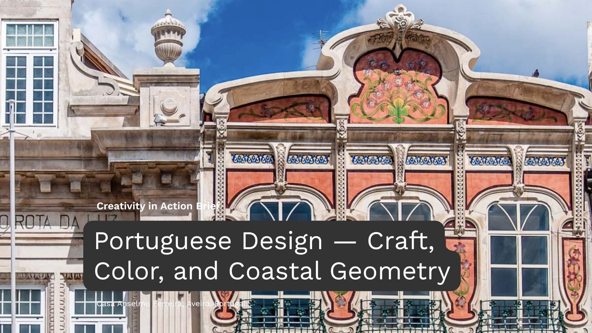
I’m excited to share a new Creativity in Action Brief inspired by Portuguese design, based on our Design Rewind article on Portuguese Design 🇵🇹.
At a time when so much design feels flat and interchangeable, Portuguese design offers a warmer modernity. It shows that clarity doesn’t have to mean coldness — and that ornament, texture, and heritage can coexist with contemporary systems.
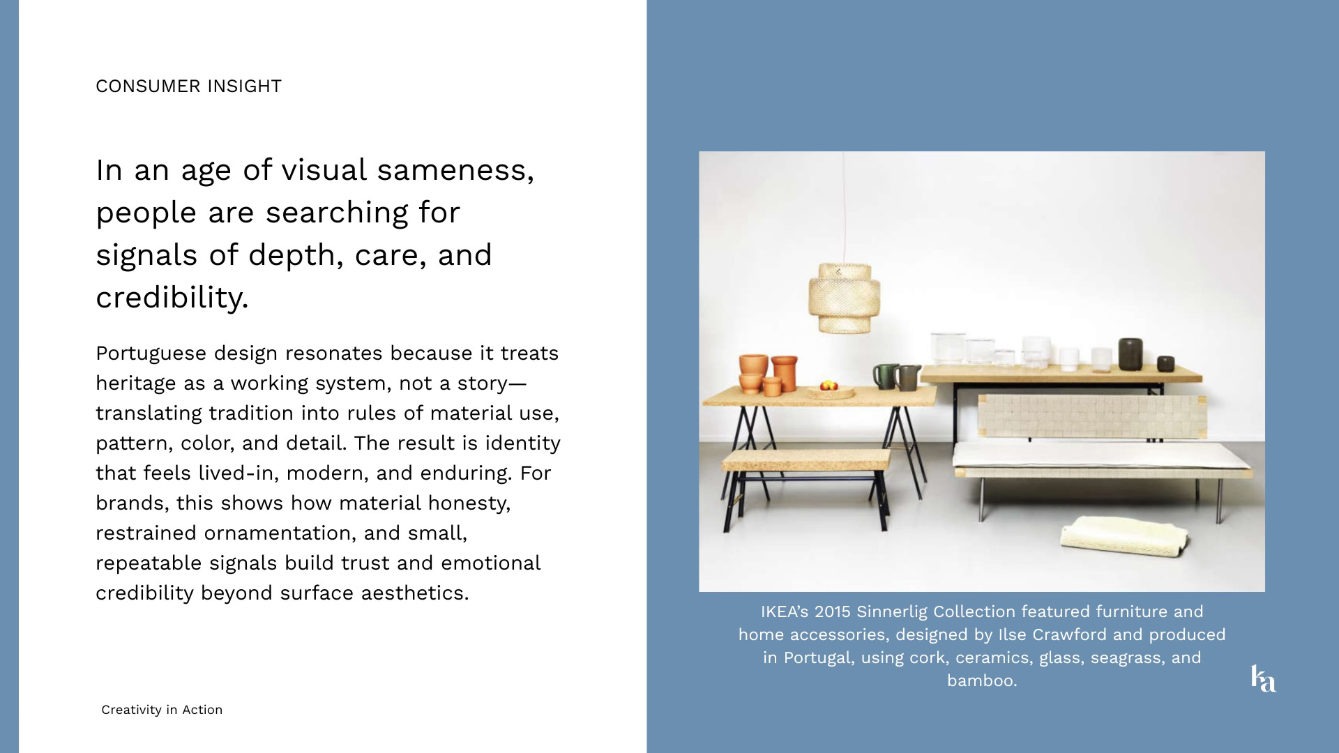
This brief builds on our exploration of Portuguese design as a living logic rather than a nostalgic reference — where azulejo geometry, cork, ceramics, Moorish pattern, Atlantic light, and layered history translate into structured, repeatable design principles.
Inside the brief, you’ll find:
A snapshot of why Portuguese design feels especially relevant today
Historical context — from Moorish influence to Atlantic exchange and global hybridity
Messaging and narrative directions, including Warm Modernity and The Atlantic Exchange
Clear visual cues and anti-patterns to guide your design decisions
A practical workshop exercise: Tile-to-System Translation
AI prompts to help you turn cultural cues into scalable brand systems